01 — Problem
This project sparked my interest immediately. With healthcare and mental health becoming increasingly inaccessible, I was excited to help pioneer a solution that makes medical help easier to reach.
The Detroit Wayne Integrated Health Network (DWIHN) wanted to consolidate their services into a single, highly intuitive mobile app. Key features included an event calendar, an interactive directory, and health screenings. Because the platform serves individuals seeking critical support, ensuring the experience remained seamless and stress-free was a core priority.
Introductory Meeting
The introductory call established the project scope and opened the floor for initial alignment. Prioritizing features proved challenging due to the extensive scope requested by DWIHN. To move forward effectively, we aligned directly with both the client and end users to identify high-impact, crucial features.
Requirements Gathering
Moving into requirements gathering, my primary focus was establishing clear UX interactions early to prevent miscommunication and mitigate scope creep.
- Targeted Questioning: I led targeted discussions around the user journey and database requirements, particularly for the provider directory.
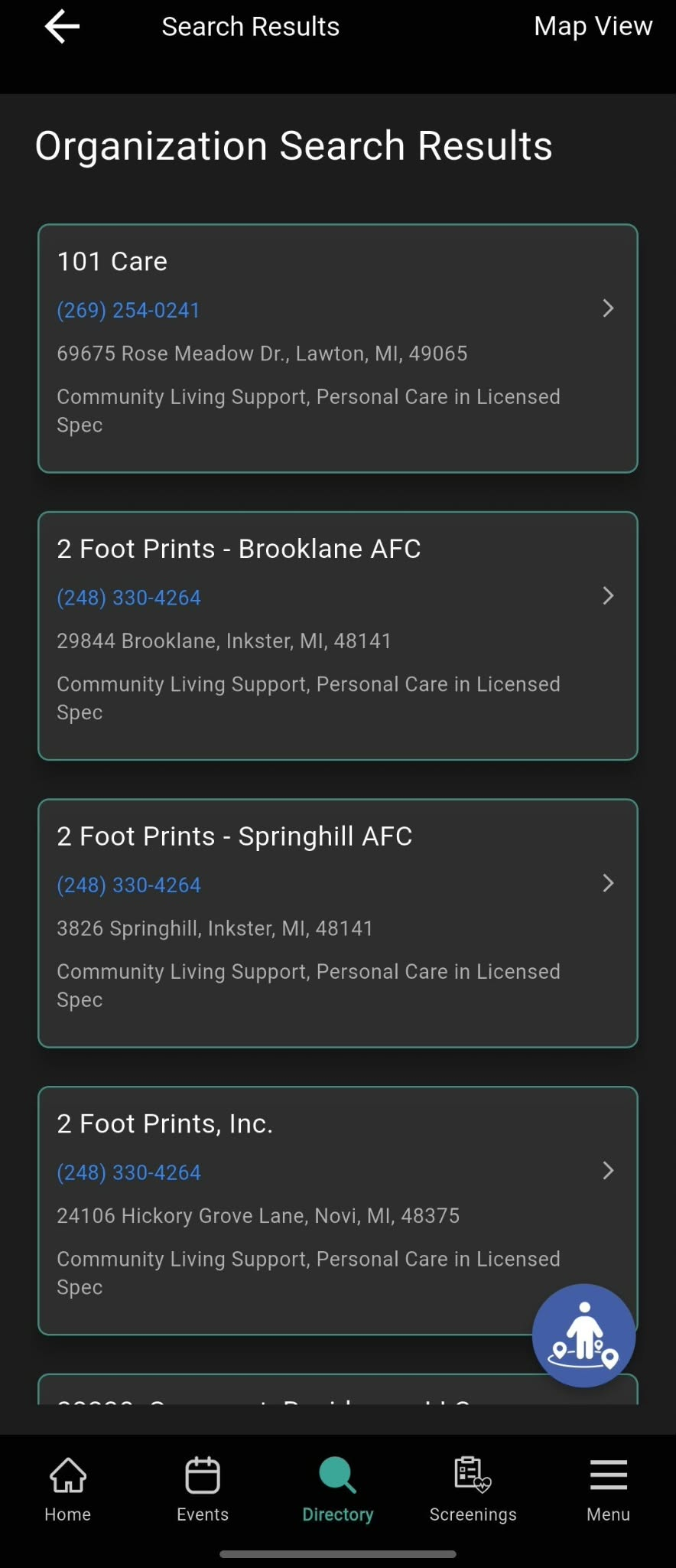
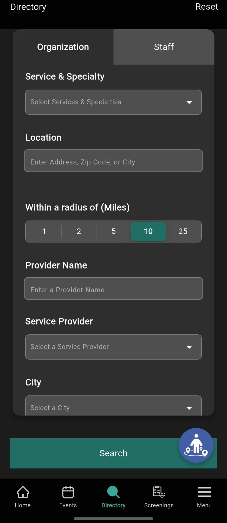
- Complete Redesign: Because the legacy directory was outdated and difficult to navigate, my guided questions ensured our new design balanced high functionality with ease of use.
Initial Designs & The "Master" Design System
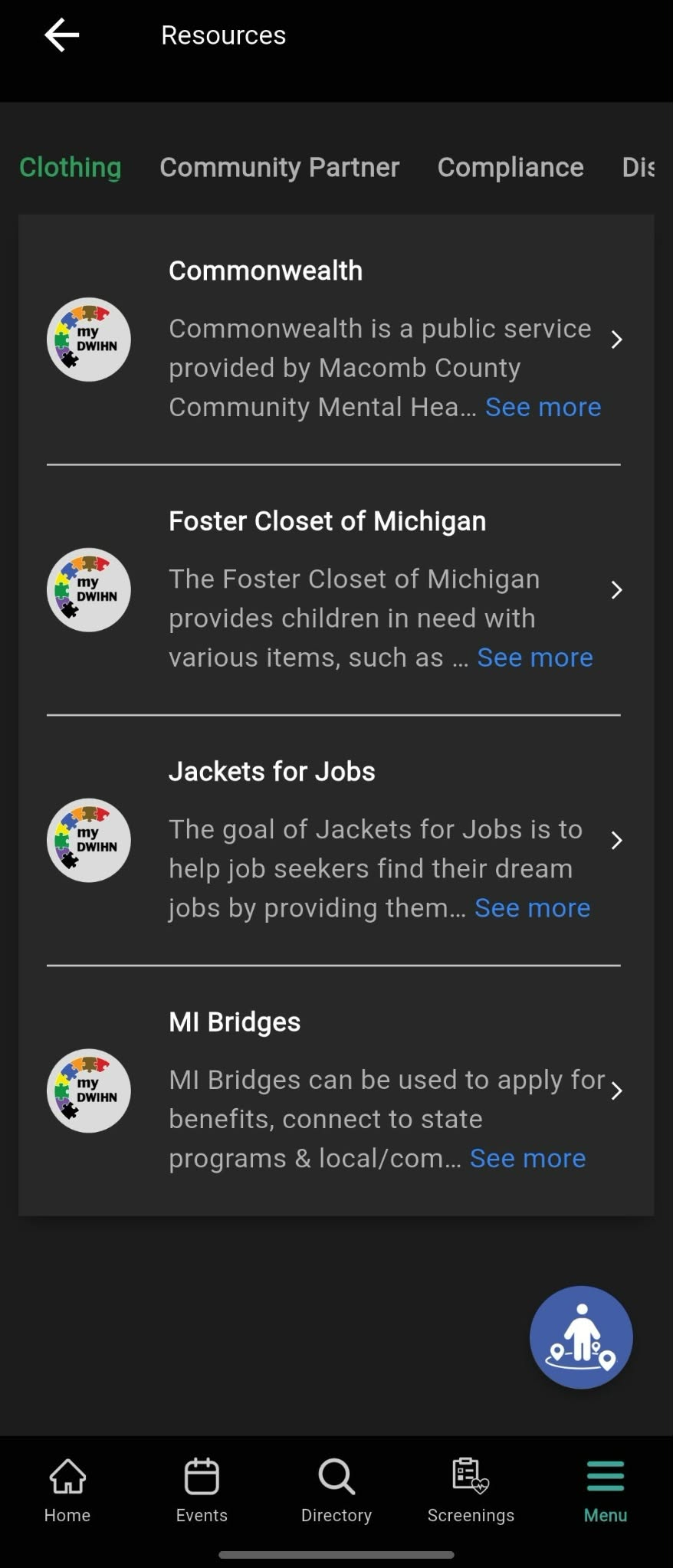
To streamline our workflow and avoid constantly rebuilding standard iOS elements (such as sign-in, settings, and calendar pages), we shifted our process by building a reusable "master" design system.
- My Role: As the lead designer for this system, I built a robust, adaptable framework that could easily flex to various branding styles.
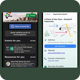
- Execution: Using this system, our team rapidly mapped out a core design flow. My responsibilities included adapting template pages to match precise app data and designing custom views like the provider directory.
Iterative Design Process
Operating under a tight timeline, we worked in iterative waves with weekly check-ins supplemented by 1–2 quick alignment sessions.
- Collaborative Cadence: We alternated between tagging the client in Figma and hosting direct reviews to maintain velocity without sacrificing design focus.
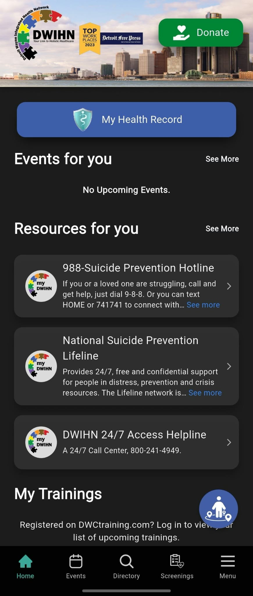
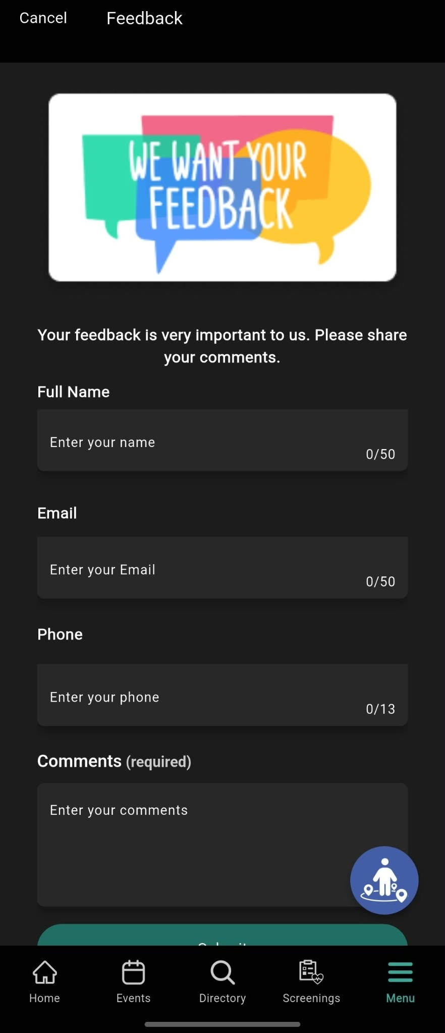
- Light and Dark Mode Optimization: I focused heavily on contrast and readability across themes. For instance, pages with generous white space in light mode required tighter composition for dark mode to ensure a seamless visual experience.
- Refining Navigation & Accessibility: Client and user testing revealed that certain pages lacked clear exit or navigation paths—a critical hurdle for users seeking urgent help. To resolve this, we added a prominent, one-click emergency resource button directly on the home page for users in high-stress situations.
Final Designs
Developer Handoff
To prepare the final designs for development, we structured comprehensive use case scenarios within Figma prototypes and organized developer inspection tools. Restructuring select flows resulted in a clean, handoff-ready system that successfully bridged design and engineering.
UPDATE (1/11/2023): The application has officially launched on iOS and Android. Links can be found below:
The outcome
~ 120,000
# residents that utilize DWIHN services
 Nihar
Nihar