01 — Problem
Charlotte County approached us with a familiar but unique problem: their current SharePoint website was outdated, unsupported, and confusing for users. What made this unique was that they wanted a complete refresh, which included updates pertaining to: branding, user flow, responsiveness, accessibility, and backend storage. This required an approach that was well-rounded, balancing both users and county admin needs while keeping an eye on accessibility, usability, and responsiveness.
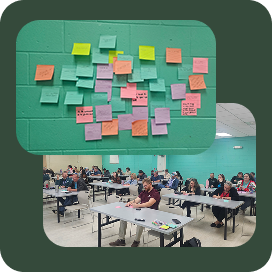
Focus Group (In-Person)
Before any redesign work started, we needed to hear directly from the people who'd actually be using this every day.
- We conducted 5 sessions over 2 days, each with around 10–15 people who work for the county
- The attendees represented employees from County-level departments such as: Administration, Construction, IT, Community Development, Emergency Management, Fire & EMS, Public Works, and more
We used the following format for each of the focus group meetings:
- Started with general questions about their intranet use, the current website, design ideals, and use cases specific to their department
- Moved on to card sorting, collecting vital information about what was currently working and what could be improved
-
Walked through the current implementation and asked a volunteer to physically test the site by completing a user journey related to search
- Noted how the user interacted with the site, and any problems they ran into (using think-out-loud protocol)
Card Sorting
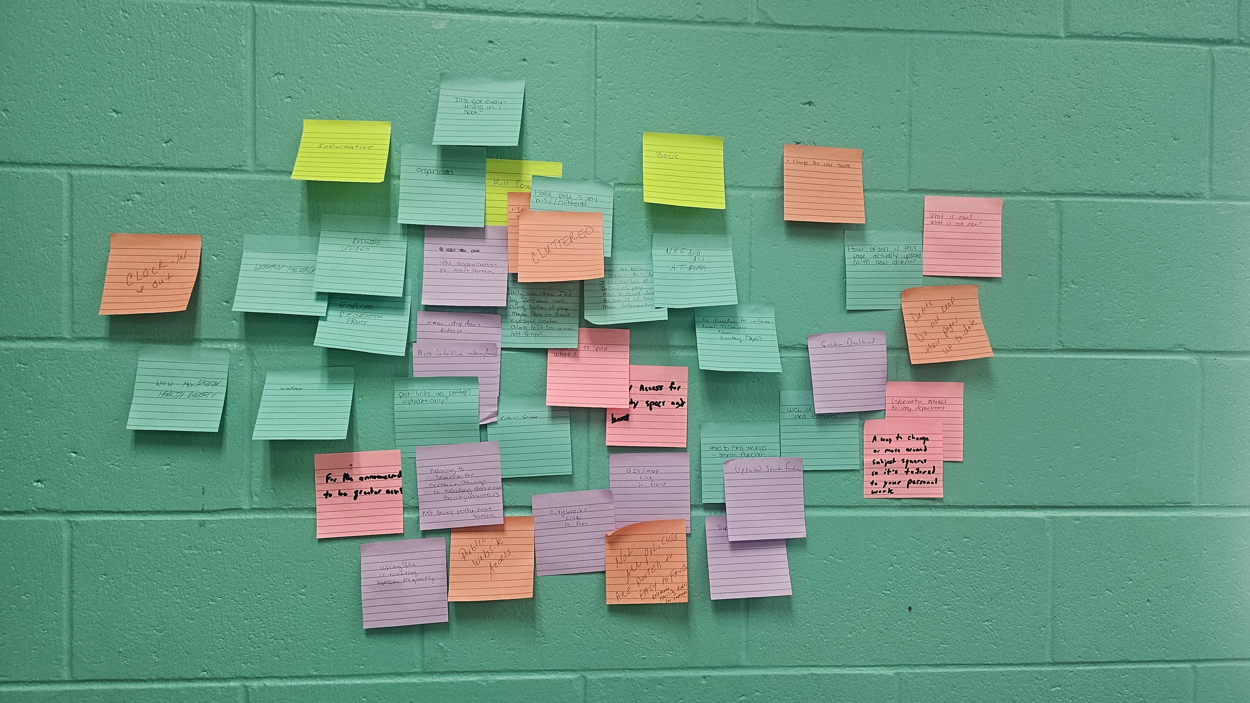
- Each focus group participant listed 1–3 positive or negative aspects of the legacy implementation
- Went through the list and grouped together related cards
- Asked follow-up questions to clarify some of the feedback
Committee Meetings (Virtual)
With ground-level feedback in hand, we brought it to the committee to reconcile what we'd heard with what leadership expected.
- 6 meetings over the span of 3 weeks
- Addressed their concerns and shared the data we'd gathered from the in-person focus groups
- The problem
- The committee wanted certain buttons prioritized for visibility, even if they weren't used often. Users wanted buttons ordered by how often they were actually used — two reasonable positions pulling in opposite directions.
- The solution
- We "pinned" 3 items in the button section and let users customize the rest, so the layout could satisfy the committee's priorities and still flex to whatever suited each person's role.
Design
With research and committee input reconciled, design had to answer to three audiences at once: the committee, department heads, and everyday users.
- Combined our findings into a fully out-of-the-box SharePoint solution, with recommendations for custom elements
- Design needed to be extremely mobile-friendly, since many users accessed it in sunny conditions out in the field
- The problem
- Committee and users had separate ideas of how much control they should have over the page.
- The solution
- We gave users control over their own view, and split committee control into two tiers — one for the overall county, one for each specific department. That created control at three distinct levels: user, department head, and county admin.
This wasn't just a redesign — it was an upgrade from an outdated, unsupported SharePoint version, so the backend needed to be rebuilt too. We got help from engineers & PMs to make sure the designs were supported by the data in the backend.
The best internal tools aren't won by the committee or the user — they're won by finding where both can actually agree.
 Nihar
Nihar